Q:怎么修改应用右上角3个点里面的内容?
A:在 App Inventor 中,应用右上角的 “三个点”菜单(也叫”溢出菜单”或”ActionBar 菜单”)是 Android 应用常见的导航区域。默认情况下,App Inventor 并没有直接提供一个图形组件来编辑这个菜单,但我们可以使用 “ActivityStarter” 或通过调用系统菜单事件来实现自定义内容哦!
✅ 实现方法:使用本文介绍的UrsAI2ActionBar拓展可以实现。
最新版拓展下载:
de.ullisroboterseite.ursai2actionbar.aix
demo下载:
原作者开发动机
对于较小的应用,可以通过按钮触发已实现的功能。然而,对于较大的应用,可用空间会迅速减少,布局也会变得混乱。ActionBar(ToolBar、App Bar)可以提供帮助。有很多实现,但我还没有找到合适的,所以自己开发了一个。
使用
应用栏,以前也称为 操作栏,是您自己Android应用中最重要的设计元素之一。它提供了 许多用户已经熟悉的视觉结构和交互控件。
通过使用 应用栏,您自己应用的外观变得与其他Android应用一致, 这样用户可以快速直观地理解如何使用该应用。它是一种特殊类型的工具栏,位于每个屏幕的顶部,用于品牌标识、导航、搜索和操作。此拓展使得 在App Inventor应用中实现 ActionBar 成为可能。
将拓展集成到AI2项目中
在设计时可用的 HorizontalArrangement 在运行时会被工具栏填充:
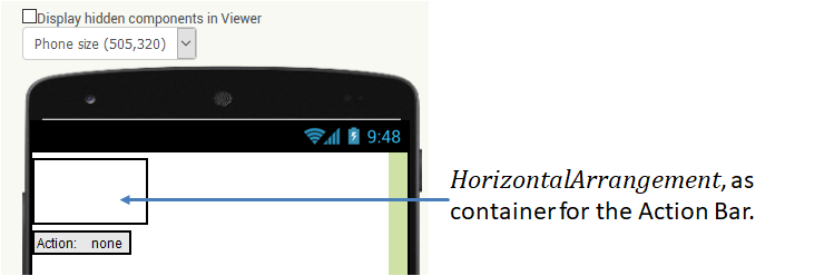
拓展将 ActionBar 的高度设置为56 DIP(在AI2中为 Pixel ),宽度填充父元素。如果您希望在设计时具有正确的尺寸,可以相应地设置 HorizontalArrangement。适当地命名组件也是有意义的。 在示例中我将其命名为 ActionBarPlaceholder。
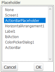
HorizontalArrangement 在设计时注册在 UrsAI2ActionBar 参数 PlaceHolder 中:
如果不这样做,HorizontalArrangement 不会被调整,并且不会显示 ActionBar。如果选择的组件不是 HorizontalArrangement 类型,则不会显示 ActionBar,并且会触发 Screen.ErrorOccurred 事件,错误号为7777。
理论上,不必将 HorizontalArrangement 放在显示器的顶部。
HorizontalArrangement 的位置决定了操作栏的位置。
注意:排列中包含的子元素会被隐藏。
配置 ActionBar
布局 ActionBar 的功能在设计器和块中可用。
最好的设计方式是在Companion中运行项目。然后您可以立即看到
ActionBar 的外观并测试功能。
ActionBar 由以下组件组成:
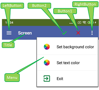
Die Symbolleiste besteht von links nach rechts aus der Schaltfläche LeftButton, dem Textfeld Title und drei weitere Schaltflächen Button2, Button1 und RightButton. Über RightButton kann ein konfigurierbares Popup-Menu geöffnet werden.
从左到右,工具栏由 LeftButton、 Title 文本字段和另外三个按钮组成:Button2、 Button1 和 RightButton。当点击 RightButton 时可以打开一个可配置的弹出菜单。
配置标题文本字段
标题文本字段使用AI2常用属性进行配置。Title 属性 确定要显示的文本。使用属性 BackgroundColor 可以设置整个工具栏的背景 颜色。使用 FontSize、FontBold 和 TextColor,可以设置大小、字体粗细和字体颜色。 TextAlignment 定义文本的对齐方式。
配置按钮
按钮中显示的符号来自特殊的TTF字体中的字符。这简化了在不同大小和颜色中的呈现。
Google提供了广泛的材料来支持应用开发。在
Material Design / Icons 页面上提供了大量符号。
这些也可以作为字体使用(MaterialIcons-Regular.ttf,版本1.017)。此字体嵌入在拓展中,可供下载
(文件夹"de\ullisroboterseite\ursai2actionbar\assets")。符号的名称(例如"arrowback"、
"menu"或"more_vert")可以/必须使用 ... ButtonSymbol 设置。
...ButtonColor 属性可用于设置符号的颜色。指定"blank"
会导致显示空格字符(如果设置了背景图像,这很有用)。
...ButtonImage 属性可用于设置按钮的背景图像。 在我的测试设备上,图像被调整为155x155像素²的大小。图像应该是正方形的。非正方形图像 会被扭曲。
配置弹出菜单
菜单与拓展 UrsAI2Popup 中的菜单相同。它链接到右侧按钮(RightButton)。 如果左侧按钮要与菜单耦合,可以通过 UrsAI2Popup 拓展的实例来实现。占位符组件可以作为锚点。
由 ActionBar 触发的事件
当点击按钮时,会触发关联的 ...Click 事件。
RightButtonClick 在弹出菜单组装之前触发。菜单可以
在此事件中进行调整。
菜单的事件在拓展
由弹出菜单触发的事件 部分中描述
UrsAI2Popup。
参考
属性
- AutoCheck
- 指定带有复选框的菜单行在点击时是否自动更改其选中状态。
- BackgroundColor
- 定义 ActionBar 的背景颜色。默认为 & HFF4862A3。
- Button1Color
- 定义按钮#1符号的颜色。
- Button1Symbol
- 定义按钮#1的符号(参见 配置按钮 部分)
- Button2Color
- 定义按钮#1符号的颜色。
- Button2Symbol
- 定义按钮#2的符号(参见 配置按钮 部分)。
- FontBold
- 指定标题文本是否应以粗体显示。
- FontSize
- 指定标题文本和按钮的字体大小。
- LeftButtonColor
- 定义左侧按钮中符号的颜色。
- LeftButtonImage
- 设置左侧按钮的背景图像。
- LeftButtonSymbol
- 定义左侧按钮的符号(参见 配置按钮 部分)。
- MenuBackgroundColor
- 定义菜单的背景颜色。可能的指定:White、Black、Default。大小写不敏感。
- MenuFontSize
- 指定菜单 项 的字体大小。
- MenuItemsFromString
- 将弹出菜单的条目定义为逗号分隔的字符串(参见 配置菜单项 部分的 UrsAI2Popup)。
- MenuItemsFromFile
- 指定一个资源文件,从中加载菜单项的定义(参见 配置菜单项 部分的 UrsAI2Popup)。
- MenuTextColor
- 设置菜单项的文本颜色。
- Placeholder
- 指定 HorizontalArrangement 实例,ActionBar 将被集成到其中。 ActionBar 的高度为56 DIP(在AI2中为 Pixel),宽度填充父元素(容器)。
- RightButtonColor
- 定义右侧按钮中符号的颜色。
- RightButtonImage
- 设置右侧按钮的背景图像。
- RightButtonSymbol
- 定义右侧按钮的符号(参见 配置按钮 部分)。
- TextAlignment
- 设置标题文本的对齐方式
- TextColor
- 设置标题的文本颜色。
- Title
- 设置标题的文本。
- Version
- 获取拓展的版本。
函数
- LoadMenuItemsFromFile(FileName)
- 从指定的资源文件加载菜单项的定义(参见 配置菜单项 部分的 UrsAI2Popup)。
- SetMenuItems(ItemList)
- 使用 List 定义弹出菜单的条目(参见 配置菜单项 部分的 UrsAI2Popup)。
- SetMenuItemChecked(ItemNo, Value)
- 设置指定菜单项的选中状态。ItemNo 是项目的编号。 计数从1开始。
- SetMenuItemEnabled(ItemNo, Value)
- 启用/禁用指定的菜单项。ItemNo是项目的编号。计数从1开始。禁用的 行以浅灰色显示,并且对点击没有反应。
事件
- Button1Click()
- 按钮#1被点击。
- Button2Click()
- 按钮#1被点击。
- LeftButtonClick()
- LeftButton 被点击。
- MenuItem1Selected(Title, Checked)
- 菜单项#1被点击。
- MenuItem2Selected(Title, Checked)
- 菜单项#2被点击。
- MenuItem3Selected(Title, Checked)
- 菜单项#3被点击。
- MenuItem4Selected(Title, Checked)
- 菜单项#4被点击。
- MenuItem5Selected(Title, Checked)
- 菜单项#5被点击。
- MenuItemSelected(ID, Title, Checked)
- 编号为 ID 的菜单行被点击。计数从1开始。
- RightButtonClick()
- RightButton 被点击。
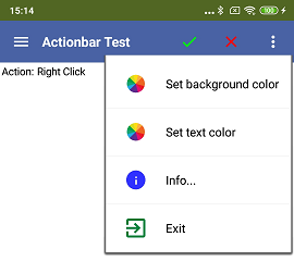
示例 ActionBarTest
 |
示例应用的大部分功能已经在上文解释过了。菜单项绑定到简单的 操作。Label 组件显示按下了哪个键。颜色选择 由 ColorPickerDialog 完成,由Zhangzqs开发。 |
 扫码添加客服咨询